Columbia Daily Spectator | Jan ~ May 2025
Updating the housing lottery calculator & dorm comparison tool
OVERVIEW
theShaft, one of Spectator's many products, is a go-to platform for undergrad housing information.
In Spring 2025, I led the redesign of theShaft, primarily focusing on the housing lottery calculator and dorm comparison tool.
OUTCOMES
Enhanced the lottery calculator
Through meetings with Columbia Housing and dev handoff
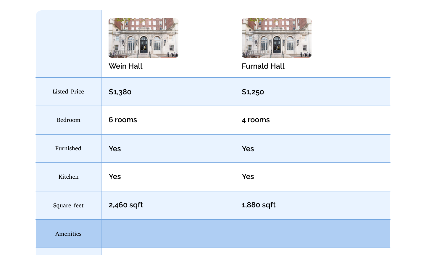
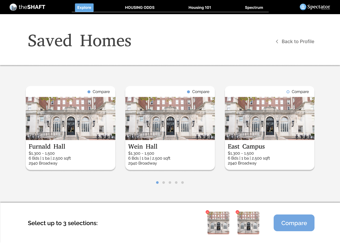
Introduced a new comparison feature
Which will roll out in Fall 2025
Revamped the information architecture
For clarity and intuitiveness
INITIAL FINDINGS
An either or situation between Columbia's official housing website and theShaft...
The official housing website is a great resource, but it's not the most intuitive or comprehensive. We found that theShaft spoke more to the needs of students, as we provide more helpful functionalities for the information they need.
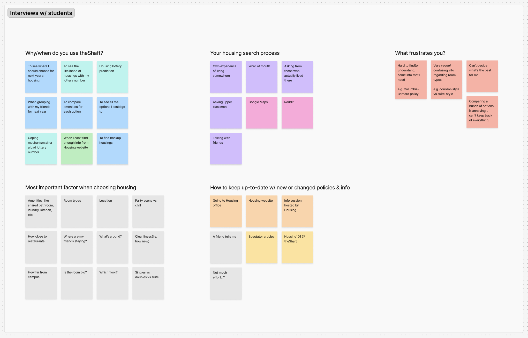
INSIGHTS
They want easy information
They don't like spending effort/time into housing, unless it's directly important to them.
Housing lottery calculator
The calculator is the most used feature on theShaft.
Areas for improvement
There's difficulty in comparing/tracking options & understanding room types and policies.
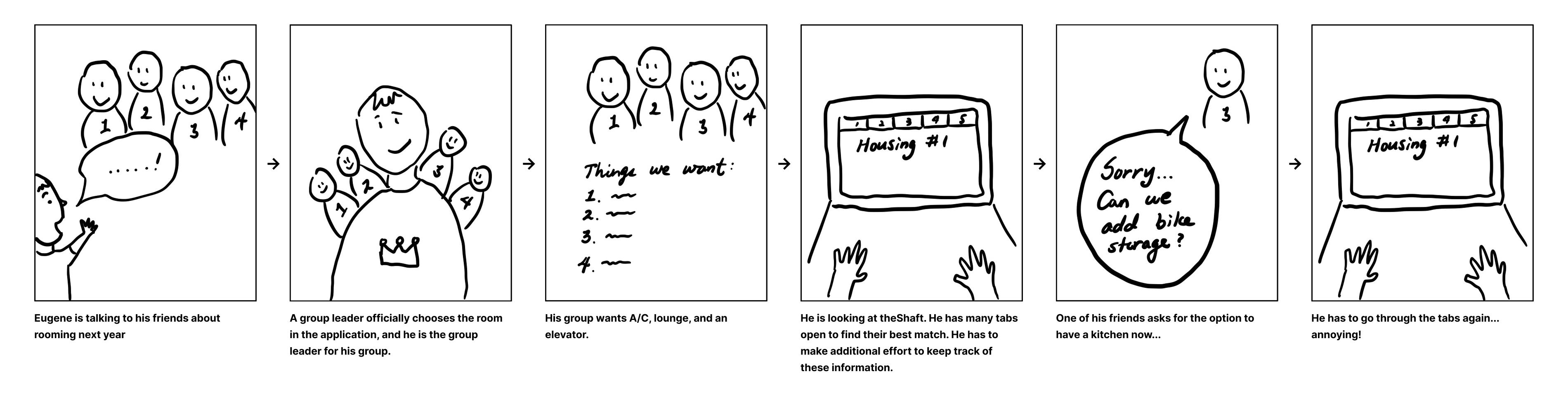
STORYBOARD
Navigating through different options and juggling them annoyed them...
We put ourselves into the shoes of a freshman trying to figure out where to live next year with their friends.
MEETING WITH COLUMBIA HOUSING
As the source of truth for housing information, we wanted to make sure we were aligned with them. We learned that a sophomore dormitory is closed for the next academic year due to construction, and also that 3 new housings will be added to the portfolio. We needed to reflect these changes in our lottery calculator and inform the students of the changes.
ROADBLOCK
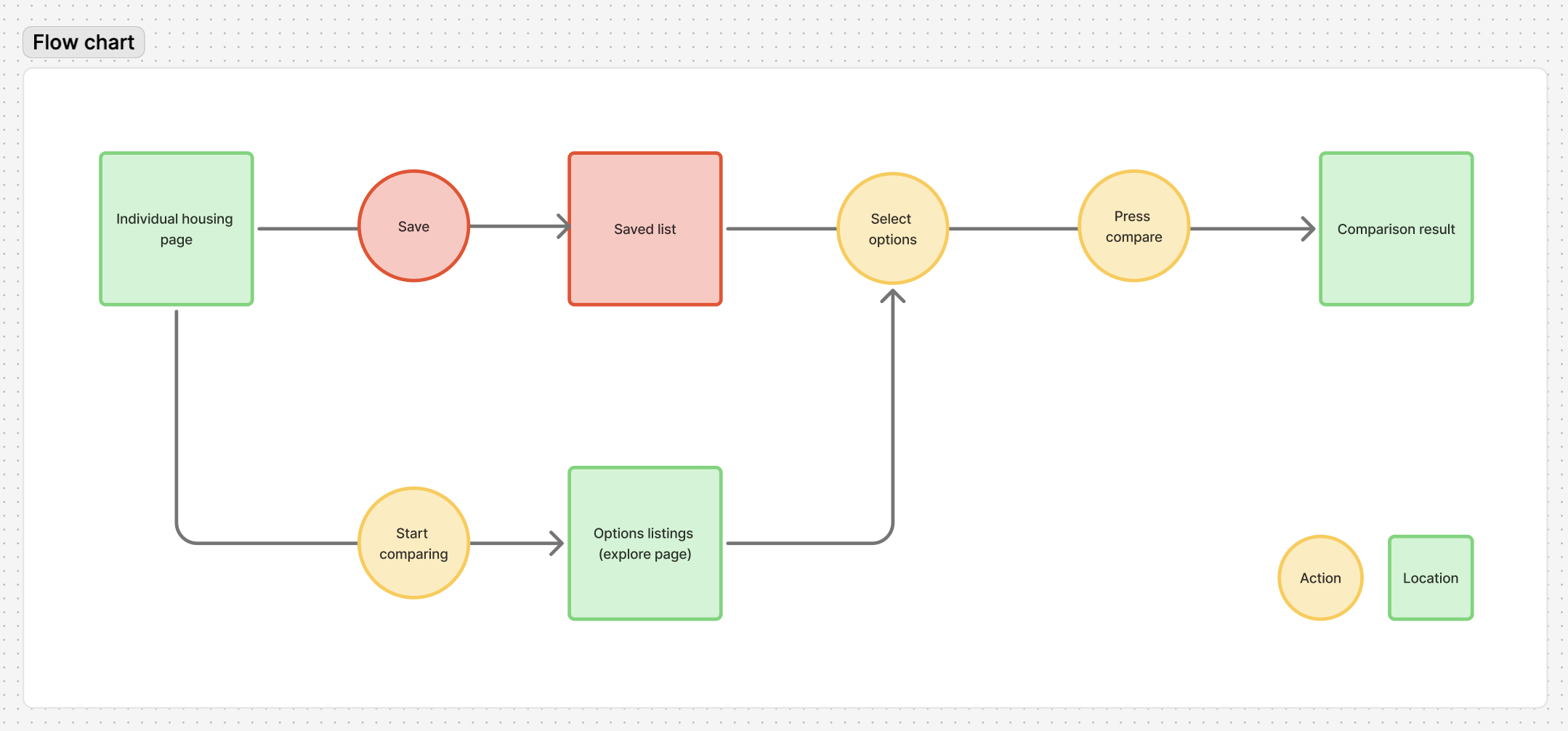
Functionality vs Feasibility
The initial comparison feature required cookies and user profile. However, there wasn't enough technical bandwidth to implement this.
HOW MIGHT WE?
Achieve the same feature, in a different way?
Cookies and user profile were the problem. We needed to find a more direct way path for comparison. To do so, I created a flowchart to visualize the user journey.
DESIGN EXPLORATION
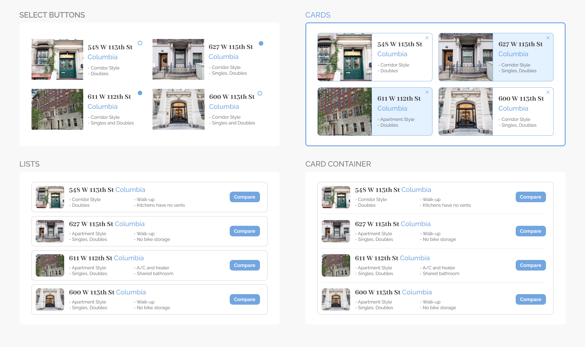
Upon discussing with the team and Head of Product, we decided that a comprehensive card would be the best approach to visually distinguish different options and encourage specific actions, which here is to compare. While Lists can include more information, we realized that by that point, the users would have some general idea of the housing options and would be more interested in the extensive comparison.
Different path, same destination
We decided to alternatively add a 'compare' button in individual housing pages, which would lead back to the listings page where students can choose options to compare.

FINAL DESIGNS
TAKEAWAYS
Leading theShaft was like a growth injection. I got to lead a cross-functional product and make meaningful changes that impact the user experience directly, and faced a real constraint that we successfully maneuvered around.
And for my time at Spectator in general, I had a privilege to be a part of the best team in Spectator – Product! Not only did I encounter challenges that helped me grow further as a Product person, but also met many many friends that I hope to stay close throughout my life.
As for my journey with Spectator, I will be leading CULPA alongside theShaft next semester! You can think of CULPA as Columbia's Rate My Professor. I am unbelievably excited for what's ahead :)